Sitka Font

Sitka Font is a serif typeface designed by Matthew Carter and commissioned by Microsoft. It was created to improve the readability of text in both print and digital formats. Distinctive for its broad range of weights and styles, Sitka was meticulously crafted to perform well on computer screens, using ClearType technology to enhance character recognition at various sizes and resolutions.
Its design is influenced by principles of optical size, meaning that the font subtly changes in style and character spacing for different text sizes, optimizing legibility across a wide range of viewing conditions.
You can find more free Serif fonts here.
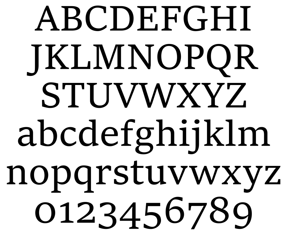
Uppercase, Lowercase & Symbols Font

History of Sitka Font
Sitka Font, meticulously designed by Matthew Carter for Microsoft, represents a convergence of technology and typography to optimize on-screen reading experiences across various devices. Launched as part of Windows 8.1 in 2013, the font drew its inspiration and name from the Sitka small tree, synonymous with adaptability.
This typographic creation resulted from extensive collaboration with the ClearType team at Microsoft, employing advanced digital techniques to enhance legibility in diverse environments, from digital documents to web content. Its design intricacies include varying stroke weights, generous spacing, and distinct character shapes, ensuring optimal readability and aesthetic appeal across different sizes and resolutions. Sitka’s development underscored a pivotal moment in digital typography, emphasizing the critical role of design in enhancing digital communication and information consumption.
Key Features of Sitka Font
Sitka Font encompasses several distinct features that contribute to its versatility and readability across a wide array of digital platforms:
- Adaptive Design: Sitka’s characters have been meticulously crafted to display optimally at various sizes, ensuring that the font remains legible and aesthetically pleasing on small screens, like smartphones, and large displays, such as monitors.
- Size-Specific Adjustments: The font includes unique designs for each point size, which means that it subtly changes its weight, spacing, and detail to improve readability as the size changes.
- Wide Range of Weights and Styles: It offers an extensive range of weights and styles, including italic and bold, allowing designers and users to express typographic hierarchy and emphasis.
- Optimized for Screen Reading: Specifically designed for digital screens, Sitka utilizes Microsoft’s ClearType technology to enhance clarity and ease of reading under various screen conditions and resolutions.
- Legibility in Text-Dense Applications: With its generous spacing and distinct character shapes, Sitka is particularly effective for lengthy texts in digital documents and web content, where legibility is paramount.
- Aesthetic Versatility: The font’s design is balanced to complement a vast range of applications, from formal documents to creative designs, making it a versatile choice for many projects.
Applications of Sitka Font
Sitka Font’s design and characteristics make it ideal for various applications. Its versatility and readability across different digital platforms allow it to be used in numerous ways, from professional documentation to creative projects.
1. Digital Media
Due to its optimization for screen reading, Sitka is extensively used in digital media, including websites, ebooks, and online publications. Its clarity and adaptability make content easily readable on any device, enhancing the user’s browsing experience.
2. Printed Materials
Although primarily designed for digital screens, Sitka’s legibility transfers well to printed materials. It is a popular choice for printing long texts such as books and reports, where its distinct character shapes and spacing make reading more comfortable for extended periods.
3. Branding and Advertising
Sitka’s wide range of weights and styles offers flexibility for branding and advertising purposes. Designers leverage their aesthetic versatility to create unique visual identities for brands and eye-catching advertisements.
4. User Interfaces (UI)
In user interface design, readability and clarity are paramount. Sitka’s characteristics make it an excellent choice for UI elements, helping to improve navigation and readability in software applications and mobile apps.
5. Educational Materials
The font’s adaptability and legibility make it suitable for digital and printed educational materials. Textbooks, e-learning modules, and other educational resources benefit from Sitka’s clear, readable text, facilitating better learning experiences.
Tips for Using Sitka Font
To maximize the effectiveness and aesthetics of Sitka Font in your projects, consider the following tips:
- Consider the context of use: Align this font’s specific weights and styles with the nature of your document or design. Bold weights might be better for headings, while regular or light weights are ideal for body text.
- Leverage size-specific adjustments: Utilize the design nuances offered for different sizes. For smaller text, ensure readability by opting for larger line spacing. For larger headings, capitalize on the font’s character detail.
- Optimize on-screen readability: Pair this font with suitable background colours and adequate contrast to enhance legibility and user comfort when designing digital screens.
- Experiment with layout and spacing: Sitka Font accommodates a variety of layout styles. Experiment with paragraph spacing, alignment, and margin sizes to discover the optimal layout for your text.
- Balance aesthetics and functionality: While this font is versatile, always prioritize clarity and readability over aesthetic considerations, especially in text-heavy applications.
- Use for branding with caution: If used for branding, ensure that Sitka’s characteristics align with the brand’s identity. Its adaptability makes it suitable for various applications, but its commonality might require pairing with more distinct visual elements for uniqueness.
- Test on multiple devices: Before finalizing designs or documents, preview your work on various devices and screen resolutions to ensure that this font maintains its legibility and aesthetic appeal across different platforms.


