Spotify Font

Spotify Font, known as “Circular,” is a geometric sans-serif typeface widely recognized for its clean, modern aesthetic. Characterized by clean lines, neat curves, and a highly readable form, it conveys a sense of simplicity and professionalism.
This font plays a pivotal role in the brand’s visual identity, and it is utilized extensively by Spotify, a leading music streaming platform, contributing to its approachable and innovative image.
You can find more free brand fonts here.
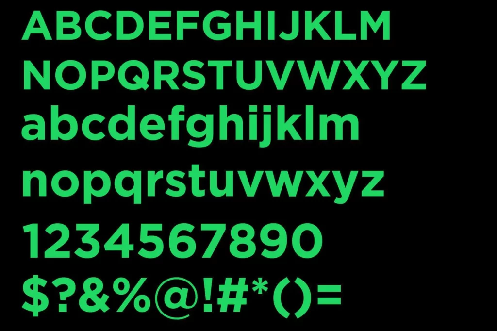
Uppercase, Lowercase & Symbols Font
History of Spotify Font
Initially, Spotify Font used various fonts for its branding and interface, relying on standard options that did not quite capture the unique essence of its brand. However 2018, a significant shift occurred when Spotify introduced its bespoke typeface, ‘Circular,’ as a central element of its visual identity. This move was part of a broader brand refresh to establish a more distinctive and cohesive appearance across all platforms.
Circular was chosen for its clean, modern aesthetic, which mirrored the Spotify platform’s simplicity and ease of use. This typeface quickly became a key player in differentiating Spotify’s visual language from that of its competitors, reinforcing its position as a forward-thinking, user-friendly service in the digital music landscape.
Key Features of Spotify Font
Spotify font, Circular carries distinctive features that contribute significantly to the brand’s identity, making it easily recognizable among millions. Here are some of its key characteristics:
- Simplicity and Clarity: Circular boasts clean lines and an uncluttered appearance, which enhances legibility and ensures the text is easy to read, even at small sizes. This simplicity mirrors the user-friendly nature of the Spotify platform.
- Round Geometry: The typeface is known for its round geometry, particularly in letters like ‘O’, ‘C’, and ‘G’. This feature adds a soft, approachable feel, inviting users into Spotify’s community.
- Distinctive ‘Q’ Tail: One of the unique aspects of Circular is the tail of the ‘Q’, a defining characteristic that sets it apart from other typefaces.
- Versatility: Circular is exceptionally versatile – it looks as good in bold headlines as in fine print. This allows Spotify to maintain consistency across various applications, from large billboards to small mobile screens.
- Contemporary Feel: The design of Circular is very much in line with modern aesthetics, giving Spotify a contemporary edge that appeals to its largely youthful audience.
Usage of Spotify Font
The usage of the Spotify font, Circular, extends beyond mere branding – it is integral to the user experience and presentation of the platform. Here’s how Spotify incorporates Circular across different elements to create a harmonious visual identity:
1. In-App Experience
Circular is used throughout the Spotify app interface, from menu labels to song titles and artist names. Its readability ensures users can easily navigate the app, enhancing the overall usability and aesthetic feel.
2. Marketing and Advertising
Spotify Font leverages Circular in its marketing campaigns, promotional materials, and advertisements. The consistency of using one typeface strengthens brand recognition and helps maintain a cohesive look across all platforms.
3. Merchandise
On Spotify’s merchandise, Circular is often the font of choice, appearing on everything from T-shirts to stickers. This use extends the brand’s visual identity into the tangible world, offering fans a way to connect with Spotify physically.
4. Digital Platforms
Beyond the app, Spotify Font uses Circular on its website, social media, and digital communications. This consistent font use across digital platforms reinforces brand identity and seamlessly integrates communication with users.

