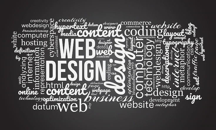
The Role Of Typography In Web Design
Introduction
Typography plays an essential role in web design and sets the tone for the entire website. It has the power to convey emotion, reinforce brand identity, and set a website apart from its competition. The most successful websites use typography wisely and strategically as a means of communicating both on-screen content and offline values.
Fonts and typefaces that are carefully selected and used throughout particular areas of the website work together to enable viewers to easily differentiate between headers, body text, titles, captions, and other visual components of a website. Whether a visitor is quickly scanning digital assets or providing feedback on layout elements, typography plays an important part in guiding user navigation and helping create well-designed websites that are instantly recognizable in today’s digital landscape.
Definition Of Typography
Typography is an art and skill that has been used in various forms since movable type was first introduced in the 15th century. In modern times, typography refers to the arranging and styling of text typefaces on a medium be it paper, screen, or otherwise.
Typographers are continuously brainstorming and seeking new ways to display text with emphasis on legibility, readability, and beauty that often varies based on the purpose for which such text will be used. From bold print ads to subtle novels, typography has come a long way from its original form, but it still includes all elements of beauty, style precision, and power within its meaning.
Importance Of Typography In Web Design
Good typography is a key pillar in effective web design. It can improve the user experience, boost SEO efforts and even help to get a website’s message across more clearly. The type chosen for headings versus body content needs to be carefully considered, as fonts such as Garamond or Georgia have become classic standards because they communicate trustworthiness in addition to having an aesthetically pleasing look and feel.
When used subtly and appropriately, typography can emphasize messages, distinguish different pieces of content from one another and create a structure so that page views are directed in their desired directions. With attractive visuals being influential on decisions made by potential customers and users, selecting the right fonts is certainly something not to take for granted.
The Impact Of Typography On User Experience
Typography plays a major role in determining the user experience of a website or application. Proper font selection and engaging layout can make all the difference in the look and feel of a page, encouraging users to spend more time looking at it and improving their overall experience. For example, large headlines using bold fonts draw attention to the main content points.
Carefully chosen colors and fonts create a visual interest that reinforces the intended message or design concept, and an easy-to-read typographical structure makes it easier for users to navigate text blocks. Ultimately, deliberate use of typography leads to enhanced user engagement which helps give websites and applications a competitive edge over others in their respective fields.
The Importance of Typography in UX Design
Typography plays an important role in UX design because it affects how easily users can find the information they need on a website or app. Poorly designed typefaces can make text hard to read or visually overwhelming, causing users to leave the page without engaging further. On the other hand, well-crafted typography can improve readability by making it easier for users to quickly scan through content looking for relevant information. It also helps create a visual interest that draws users in and encourages them to engage further with the content.
Another important aspect of typography is its ability to convey emotion. Different typefaces evoke different emotions from viewers a bold sans serif font may be seen as modern and contemporary while an ornate serif font may be seen as traditional and classic. By carefully selecting fonts that match the tone you want to convey with your content, you can ensure that users are getting the right message from your site or app.
Optimizing Typography for UX Design
When optimizing typography for UX design, there are several factors you should consider. Here are some tips on how to incorporate good typographic practices into your design process:
- Choose fonts based on their legibility and make sure they’re easy to read at various sizes and distances from the viewer’s eye.
- Use contrasting colors for text and background so they don’t compete with each other.
- Incorporate whitespace into your design so the text stands out from its surroundings.
- Utilize hierarchy when presenting information this will help guide readers through complex pieces of content.
- Stick with one or two main fonts throughout your site/app too many fonts can lead to confusion.
- Test out different typefaces before settling on one it’s important that you pick a font that fits with both the content and overall aesthetic of your project & lastly, always keep accessibility in mind to ensure all text is readable regardless of the user device or browser settings!
Choosing The Right Typeface
Choosing the right typeface is an important decision when it comes to text-heavy projects. Typefaces are everywhere, from websites to books and business cards, it’s essential to select one that both looks good and complements the overall design. It might help to consider how formal or informal the project is, as deciding on a more traditional font can give a project an air of sophistication.
Additionally, browsing through established typeface libraries can shed light on new and interesting designs. Similarly, paying attention to platforms such as Twitter and Instagram for popular trends in font design may be beneficial when choosing a typeface for your project. Ultimately, picking the right typeface can make all the difference in making your project stand out amongst the rest.
Serif vs Sans Serif
The first step in choosing a typeface is understanding the differences between serif and sans serif typefaces. Serif typefaces are fonts with small lines attached to their ends, such as Times New Roman or Georgia. These lines give off an elegant and traditional feel, making them great for professional settings or long documents that need to appear formal. Sans serif fonts lack these lines, giving them a modern and minimalistic look, perfect for shorter documents or displays like logos or headlines that need to stand out from the crowd.
Type Classification System
Once you’ve decided whether you want a sans-serif or serif font, it’s time to move on to classifying your font further by its specific style characteristics. To do this, designers use something called “The Type Classification System” which consists of four categories: Old Style, Transitional, Modern, and Slab Serifs.
These categories are determined by examining certain elements of a font like its weight or thickness, stroke contrast, stress angle, etc. Knowing these characteristics can help you narrow down which typeface best suits your needs and design style preferences.
Readability
The last step in choosing a typeface is ensuring it is readable enough for its purpose. Readability refers to how legible text appears when displayed on screen or print media, if it isn’t legible enough then no matter how visually appealing it may be it won’t serve its purpose properly.
To check this you can simply make sure each character is distinct from one another without any overlapping elements and that there’s enough space between each letter or word, both factors will contribute greatly towards successful readability levels in any document or display.
Typographic Principles In Web Design
Typographic principles in web design are essential for creating a user-friendly and professional website. To have a well-written, organized, and visually appealing website, designers must understand alignment, hierarchy, contrast, and proximity when creating content. Alignment keeps text or graphics in the same line or space to give viewers an orderly feel. Hierarchy is how each piece of content is communicated to viewers in order of importance, this allows viewers to move through the site with ease by quickly deciding which pieces of information they want to ignore or investigate.
Contrast is how elements differ from one another in color or weight, this ensures that everything on the page helps in communicating its message instead of cluttering up a viewer’s experience. Proximity ties like ideas together into clean groupings that allow viewers to keep track of where they are within a page as opposed to becoming lost among other topics. With all of these typographic principles in place, websites become captivating spaces for their users.
Readability & Legibility
The readability and legibility of text on a website are always important to consider. Readability refers to how easily someone can read text on a page, while legibility describes how clearly letters appear and how recognizable they are.
Text that is too small, or of an unfamiliar font family can make reading difficult, this puts people off staying on your site as it takes extra effort to understand what is being said. As such, it’s important to ensure your text is readable by using large enough font sizes and easy-to-read fonts such as Arial, Sans Serif, Helvetica, Georgia, or Verdana.
Creating Contrast & Balance
Contrasting colors create visual interest and help direct users’ eyes to where you want them to go for example, if you have a header in bold blue and then use light grey for smaller text beneath it, readers will be able to quickly spot the header which helps guide their navigation throughout the page.
You should also strive for balance in your typography too much text crammed into one area can cause confusion while having an uneven distribution of fonts throughout your pages could make it harder for readers to identify headings from the body copy. Aim for symmetry in your pages by evenly spacing out fonts across sections so readers know exactly where information begins and ends without having to search for clues within the layout itself.
Using Type Hierarchy & Scale
Type hierarchy is another essential element of good web design as it helps users distinguish between different types of content with ease, headings become more prominent than subheadings which stand out from body copy etcetera.
When creating type hierarchies on websites you should ensure that each level uses its own unique size scale, this way users can immediately identify various pieces of information even if they are placed close together on the page. For example, most websites use large font sizes for headings but smaller font sizes for body copy so readers are aware that the heading carries more importance than the paragraph beneath it.
Effective Typography In Web Design
Effective typography can make a big difference when it comes to web design. Flashy visual elements such as bright colors and attractive images are often what draws the eye, but well-designed typography, or fonts, are just as important for creating a website that is aesthetically pleasing and easy to read.
Carefully chosen typefaces convey a message in themselves, create emphasis on certain parts of the text, and help to neatly organize information for the visitor. Ultimately, effective typography helps make websites look great and ensures visitors have an enjoyable user experience.
Tips For Effective Typography In Web Design
Here are some tips for effective typography in web design that will help you make a lasting impression on your visitors.
Fonts Matter
The font you choose for your website plays a major role in how it looks and feels. The wrong font can throw off the entire design, so it’s important to select one that fits the tone and style of your website. You should also consider how easy it is to read on various devices, as well as its compatibility with different browsers.
Create Contrast
Contrasting font sizes, colors, and styles will help draw attention to certain parts of your website and make them stand out from the rest of the content. This can be used to emphasize key points or break up long blocks of text into more manageable chunks for readers. However, you don’t want to go overboard with too many contrasting elements as this could make it difficult for readers to focus their attention on any one part of the page.
Pay Attention To Line Spacing
Line spacing is just as important as font size when it comes to readability. Too much line spacing can make text look scattered and disorganized, while too little can make it difficult for readers to distinguish between lines. Finding the right balance between these two extremes will ensure that your text looks neat and organized while still being easy to read.
Conclusion
Typography plays an important role in web design because it sets both the tone and structure of any given page. It’s imperative that designers understand how readability, legibility, contrast & balance work together when creating content-rich websites that provide visitors with a positive user experience no matter what device they are using or where they access your site from. With these tips in mind, you’ll be well on your way toward designing pages with effective typographic principles.
Free Fonts:
 The Psychology Of Font Choice In Branding
  How To Install And Manage Fonts On Your Computer
  Creating Custom Fonts: A Step-by-Step Guide
 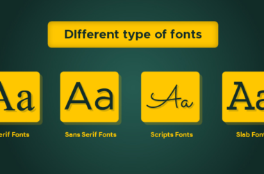 The Difference Between Serif And Sans-serif Fonts
  The Role of Font Licensing In The Design Industry
  The Top 20 Web & Print Fonts For Professional Use
  Tips For Optimizing Web Fonts For Fast Loading Times
  Tips For Optimizing Print Fonts For Clarity And Readability
  Cinzel Font