Stanley Font
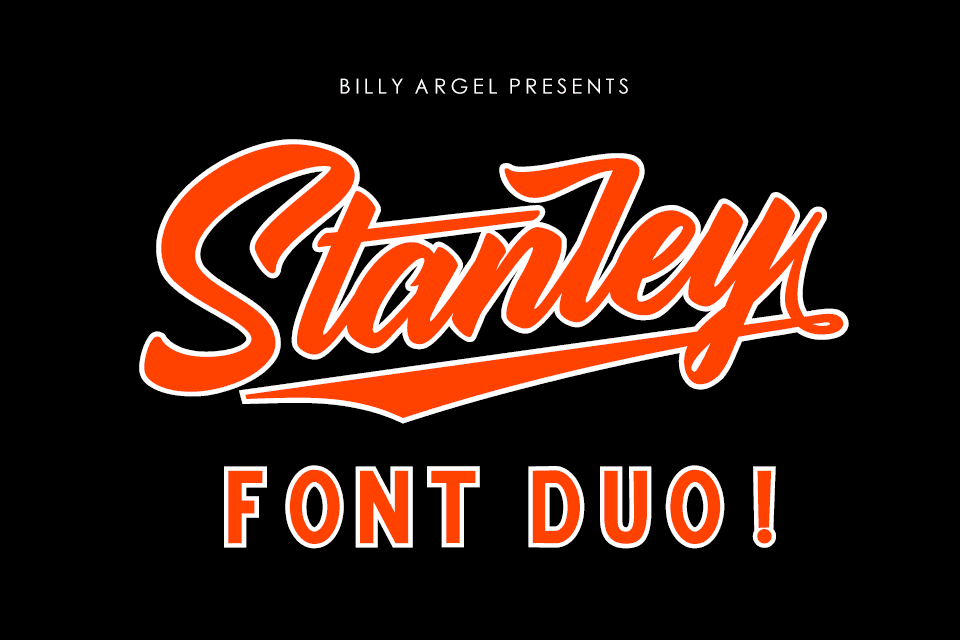
Stanley Font is a versatile and charismatic typeface, known for its blend of modern and classic design elements. It combines the sturdiness and authority of traditional serif fonts with subtle, contemporary curves, making it suitable for a wide range of applications, from elegant print materials to dynamic digital presentations.
This font’s unique character stems from its ability to convey reliability and sophistication, thereby providing designers with a powerful tool to enhance the visual appeal of their projects.
You can find more free Old School fonts here.
Uppercase, Lowercase & Symbols Font


History of Stanley Font
Stanley Font, known for its distinctive and elegant serif design, was created by Ludovic Balland in the year 2012. From the outset, it was designed with contemporary needs in mind, blending traditional serif characteristics with modern flair. The font was inspired by the typographic designs of the 19th century, a period known for its significant evolution in print technology and typography.
Balland’s vision for Stanley was to craft a typeface that would perform beautifully in both print and digital mediums, making it versatile for various design applications. Over the years, Stanley Font has gained popularity among graphic designers and typographers for its readability, classic proportions, and timeless aesthetic, making it a preferred choice for branding, editorial, and artistic projects.
Key Features of Stanley Font
- Elegant Serif Design: Stanley Font’s serif design is both elegant and functional, making it suitable for a wide range of applications.
- High Readability: Its high readability makes it an excellent choice for both print and digital media, particularly for long texts.
- Contemporary with Traditional Flair: While it is inspired by 19th-century typography, its design suits contemporary needs, blending historical elegance with modern aesthetics.
- Versatility: The font is versatile and capable of performing beautifully in various design applications such as branding, editorial work, and artistic projects.
- Classic Proportions: Stanley maintains classic proportions that contribute to its timeless appearance.
- Digital and Print Performance: Designed to excel in both print and digital mediums, ensuring consistency across different platforms.
How to Use Stanley Font
To effectively incorporate Stanley Font into your design projects, it is important to understand not just its aesthetic appeal but also how to best apply it to meet your design goals. Here are some detailed guidelines:
Choosing the Right Context
- Branding Projects: Stanley Font shines in branding materials, offering a sophisticated touch that can elevate a brand’s identity.
- Printed Materials: Ideal for use in books, magazines, and brochures, its readability and classic proportions make text blocks appear clean and inviting.
- Digital Platforms: Websites and digital publications benefit from Stanley’s excellent screen performance, enhancing user experience with legible and attractive text.
Pairing with Other Fonts
- Complementary Fonts: Pair Stanley with a sans-serif font for contrast in both print and digital layouts. A well-chosen sans-serif can complement Stanley’s serifs for headings, subheadings, or body text, ensuring readability and visual interest.
- Avoiding Clashes: Avoid pairing Stanley with other serif fonts that are too similar in style, as this can lead to a lack of contrast and visual monotony in your design.
Typography Settings
- Size and Spacing: For optimal readability, pay attention to font size and line spacing. A larger size for headings and a comfortable line spacing for body text ensure that your content is easily readable.
- Colour and Contrast: Utilize colour contrast effectively to make your text stand out. Stanley Font’s elegance is enhanced when used with a thoughtful colour scheme that complements its classic design.
Application in Web Design
- Web Fonts: If using Stanley Font for web projects, ensure it is properly embedded in your site’s CSS to maintain its aesthetic across different browsers and devices.
- Responsive Design: Adjust font sizes and line heights for different devices to maintain readability and visual harmony in your design.
By following these guidelines, you can maximize the potential of Stanley Font in your design projects, leveraging its unique blend of traditional elegance and modern versatility to create compelling and visually appealing designs.


